My capstone as an Art Director.
My final semester at the University of Missouri was spent logging 163 hours for my Capstone Project with AdZou Student Advertising Agency.In the Spring of 2022, I joined a team of seven fellow strategic communications graduates tasked with developing a creative campaign for a real-world client, The Prison Journalism Project (PJP).
The Prison Journalism Project is a non-profit news organization that aims to create the first nationwide network of prison correspondents. The organization launched at the beginning of the pandemic with large aspirations and a small subscriber base. The Prison Journalism Project tasked AdZou to research, identify and expand the brand's target audience.
As the team’s art director and graphic designer, I was responsible for compiling the semester’s work into an 80-page InDesign plan book.
Brand solutions start with research.
The secondary research process with market exploration. Here, the team compiled data about the PJP’s competition, category, costs and consumer. A situation analysis and a SWOT comparison were written and presented to the client.
Primary research began with a questionnaire sent to the subscribers of the PJP’s newsletter. From this survey, the team gathered insights about who the audience of this organization truly was, and what they cared about.
Survey respondents were given an opportunity to indicate if they were interested in an in-depth interview.
Grace’s role throughout the research process was to interview two formerly incarcerated PJP writers, determine how their insights can be used to better the organization and visualize the final data.
Read more about the research process on pages 6-13 of the plan book.
A big idea inspired by research findings.
As the group’s Graphic Designer and Art Director, I took on the bulk of the creative process for the campaign. As the team shifted gears into creative development, I designed and pitched three big idea logos. These concepts were backed by our research findings, which defined the PJP’s audience as community-driven, educated, change-makers looking for media that challenges the status quo.
Final campaign logo:
The big idea “Break through the clutter,” and the complimentary tagline, “Escape the echo chamber,” were selected.
This big idea stemmed from PJP’s desire to be positioned as a reliable and authentic news organization. Our team aimed to position the PJP as the remedy to a cluttered array of media.


logo with tagline only:Read more about this big idea on page 34 of the plan book.Now that the campaign’s big idea and target audience were selected, it was time to determine the tactics the PJP should use to prove that they truly can, break through the clutter.
A campaign backed by a big idea.
For each proposed advertising tactic, I designed mockups to allow the campaign to truly come to life. From billboards to Instagram stories, explore how each design inspired one another, leading to a flush, cohesive campaign.
See page 38 in the plan book to explore the final four campaign tactics.See pages 22-27 in the plan book to read the target consumer profiles.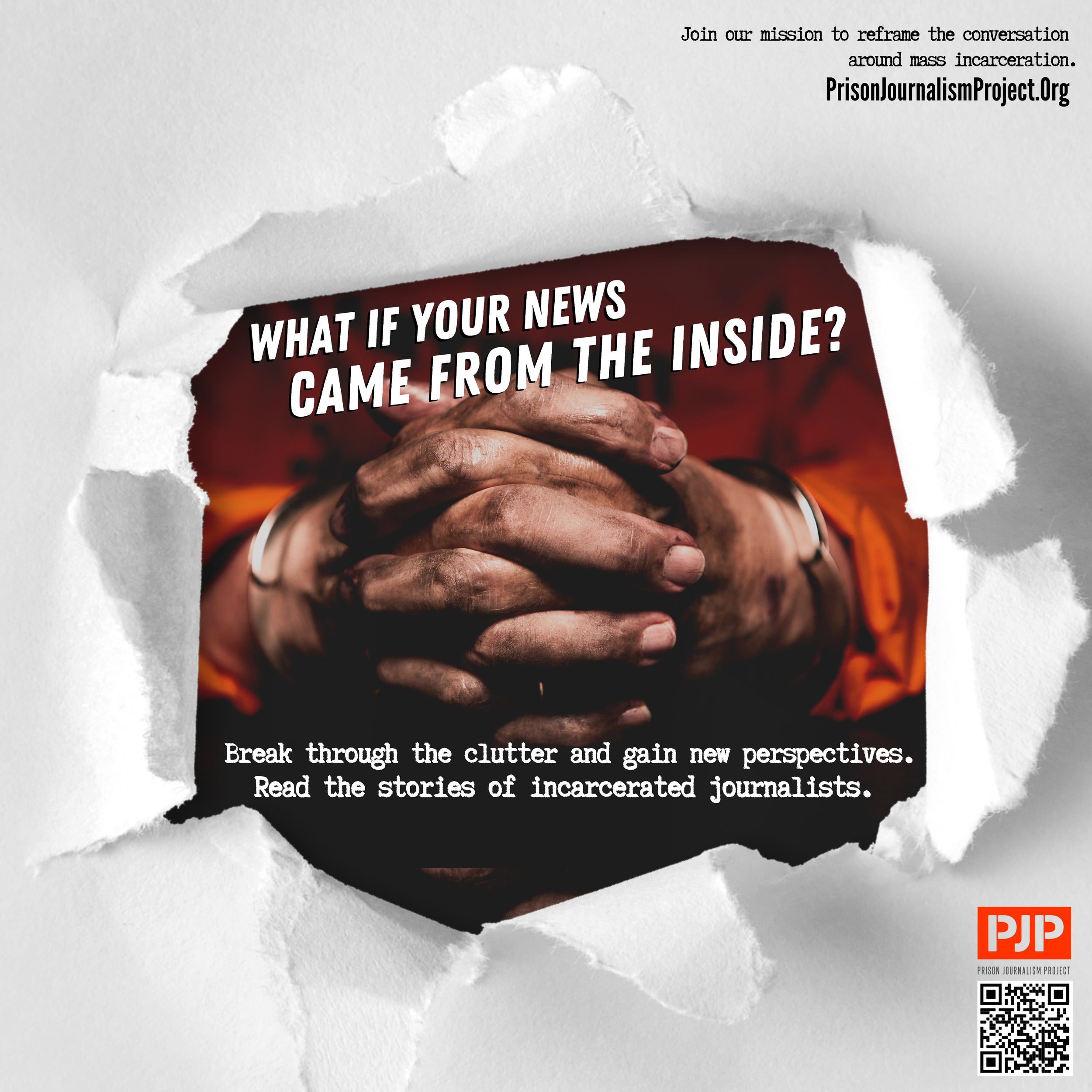

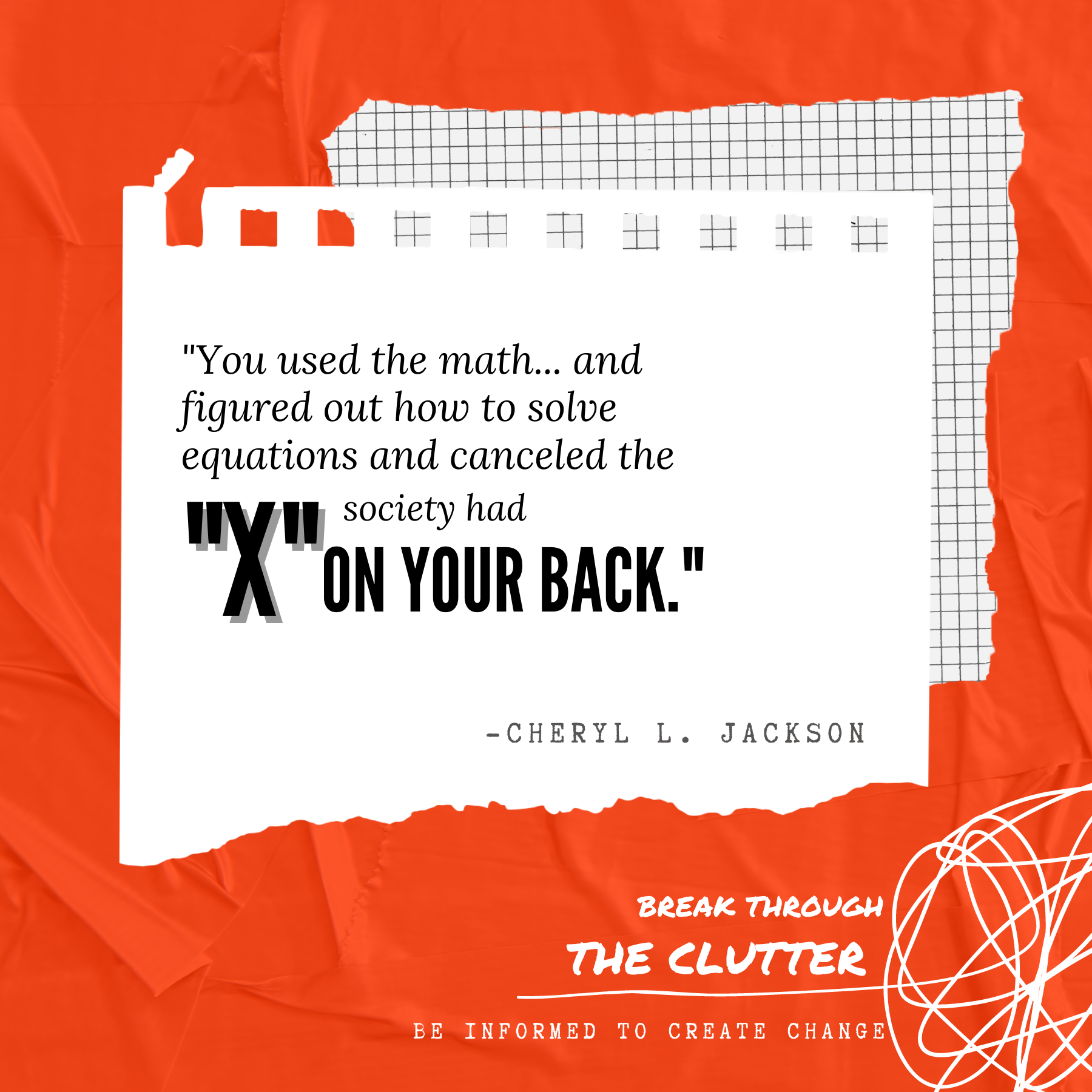
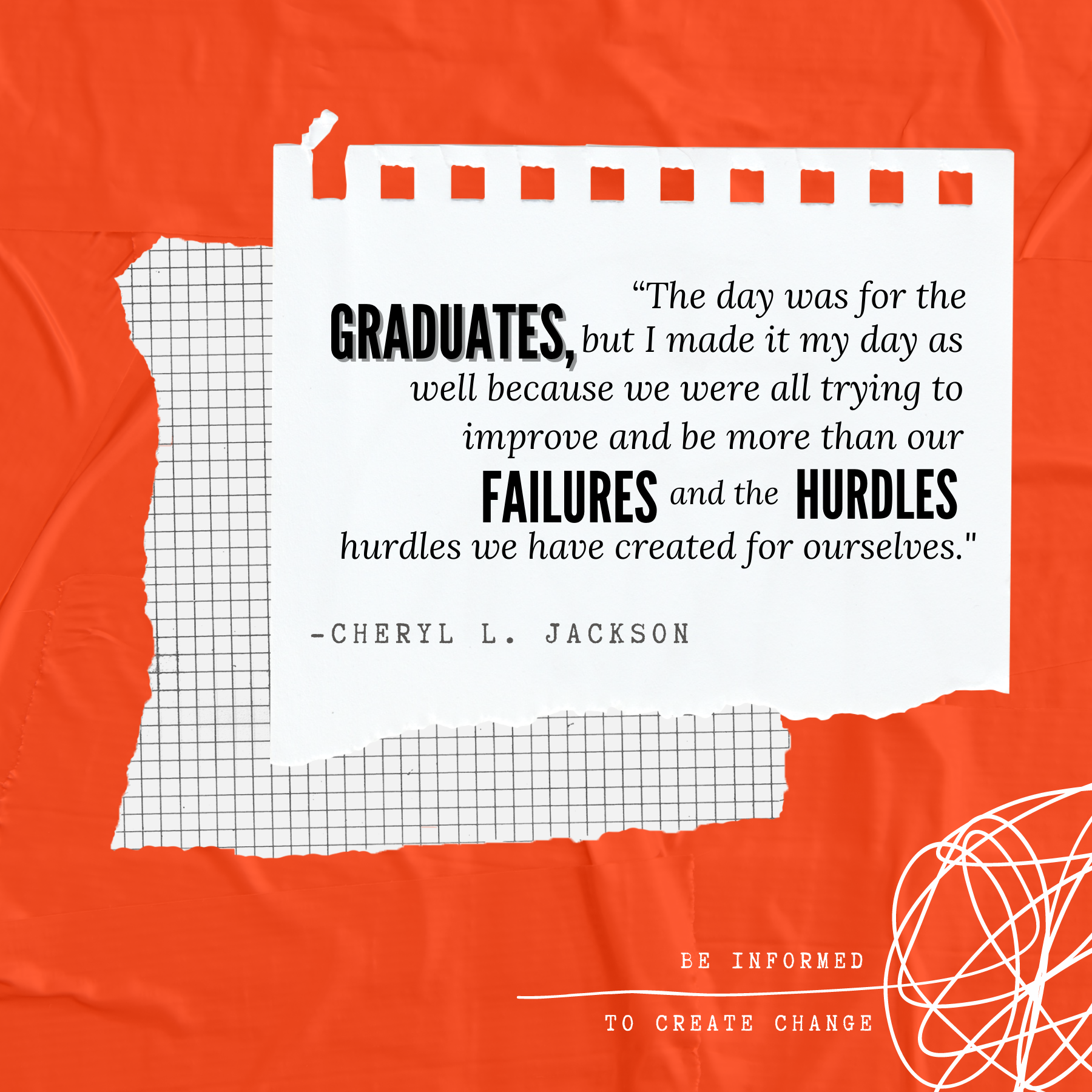
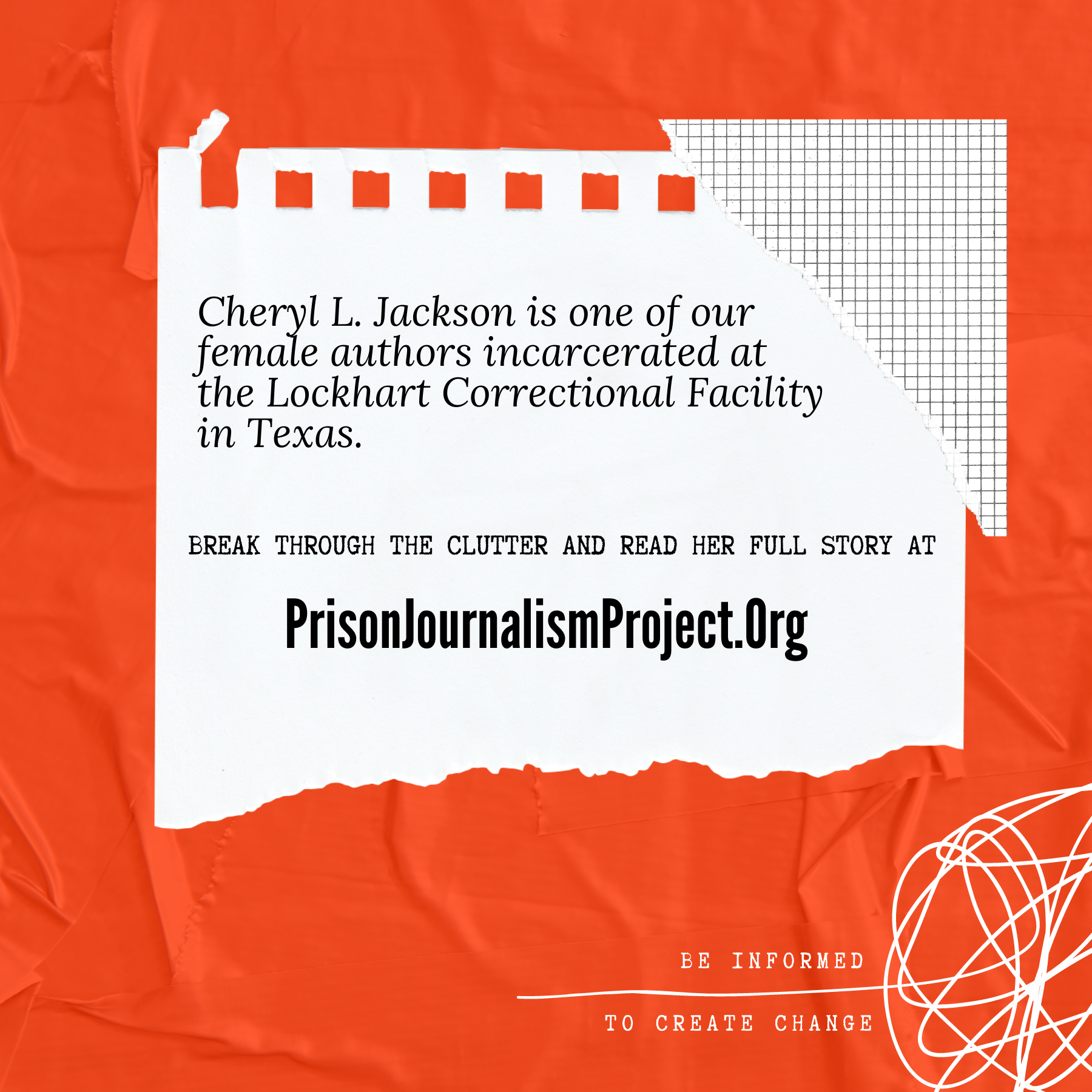
Read more about this print advertisement on page 62 of the plan book.This print ad…
attracts an educated, news-reading audience to consider an alternative form of media. This was one of the few times throughout the campaign that I relied on inmate-based imagery. I wanted to ensure that if readers glanced over this ad, they would want to do a double-take.
I believe this mockup quickly became my favorite of the campaign because of the fluidity between the visuals and the copy, both of which I was responsible for. This ad became an example of why I believe it so important to be ambidextrous in copywriting and design. Creatives that are unafraid to help their copywriters with elements of a campaign can create fresh content.

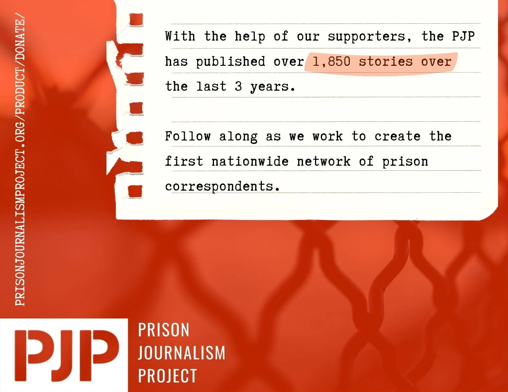
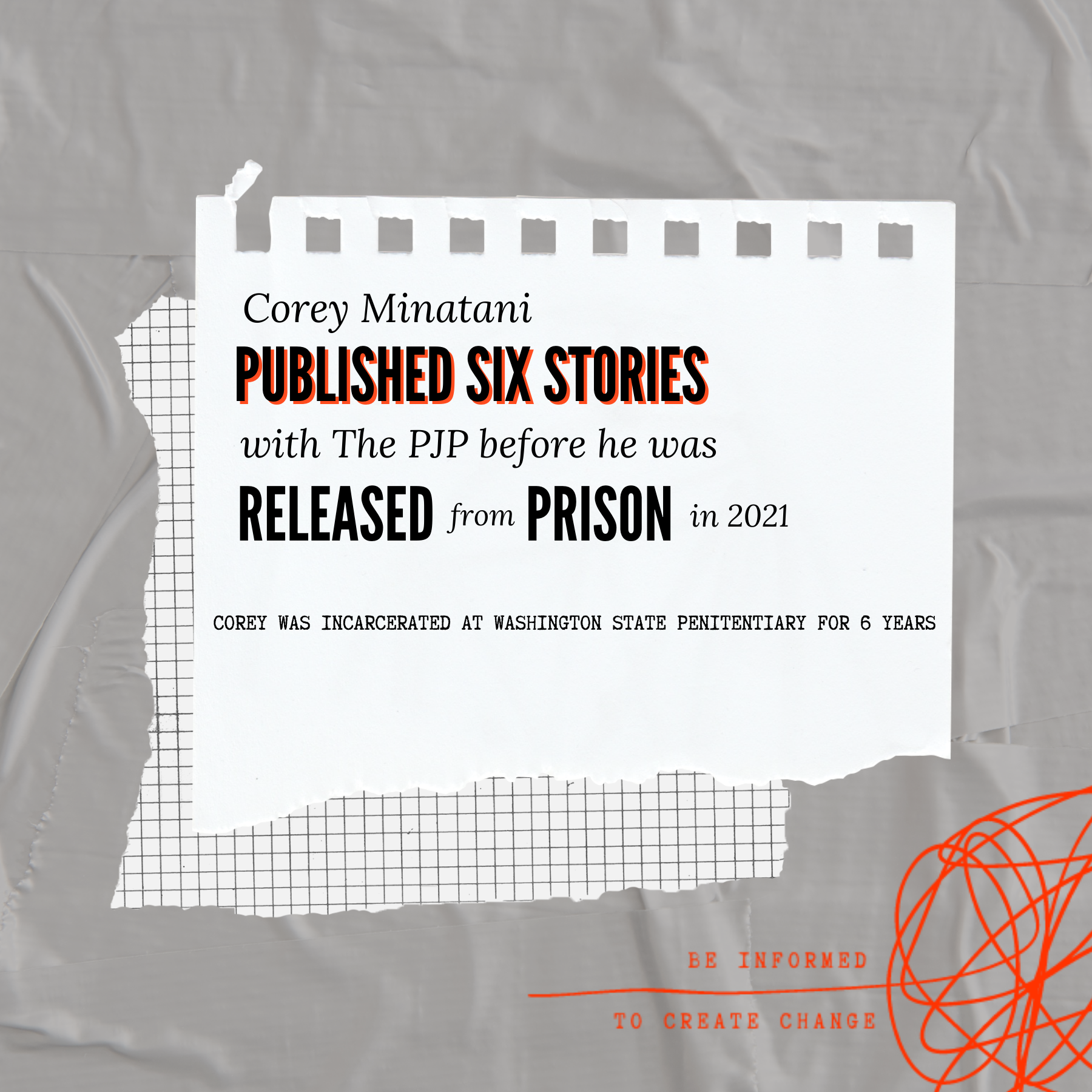
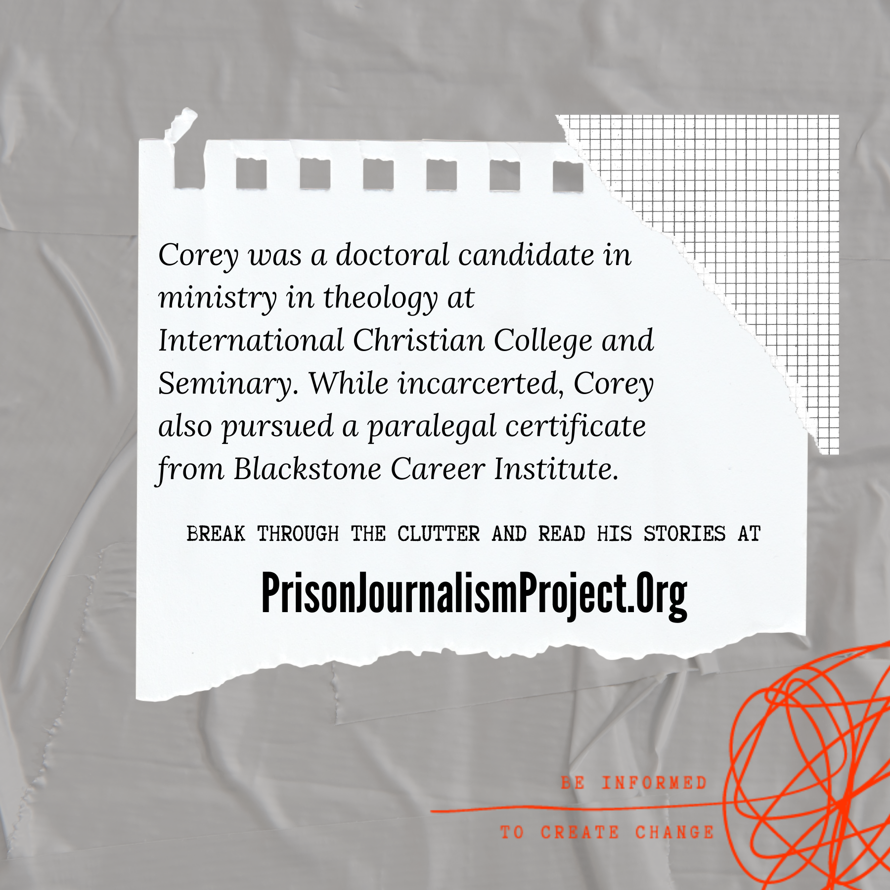
See page 64 of plan book to learn more about the logistics behind PJP Donation Cards. were proposed as an out-of-home advertising tactic to help reach fundraising goals. This design was my first to rely on the imagery of a photo included in an issue of the PJP’s print edition. This inmate is seen writing in a composition notebook with “respect” tattooed on his arm. The combination of this photo and the piece of notebook paper, makes it feel as if the inmate is writing directly to the viewer.
The donation cards would be double-sided and should be displayed in two stacks, facing opposite directions, in order to display the illusion that the loose leaf paper is connected.
PJP Donation Cards…


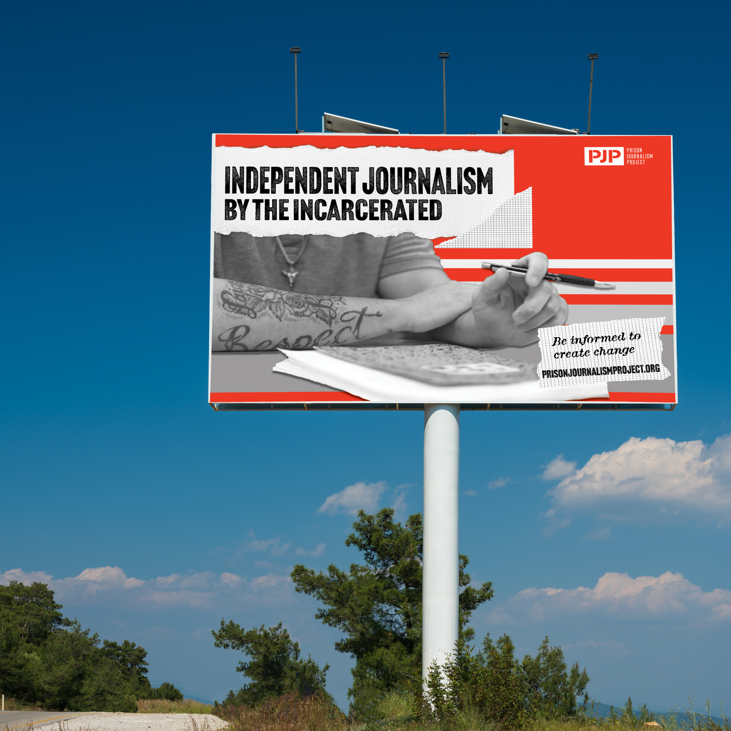
Billboards…
only have a few seconds to capture your attention before it is too late. With these designs, it was crucial to inform drivers efficiently. The team included Billboards as a bonus tactic for the PJP to consider for future campaigns. The bold type describes the organization’s main purpose and is accompanied by the website, logo, and tagline.
See page 66 of the plan book to learn more about our bonus tactic, billboards. 


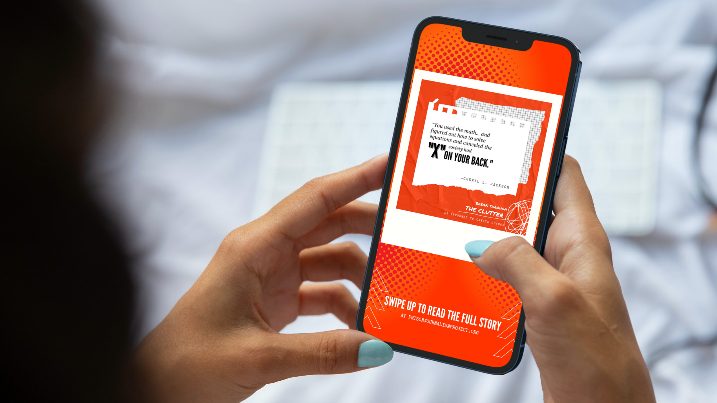
An Instagram Rebrand…
was the most urgent tactic we suggested to the PJP. During my creative assessment of the brand, this social media platform had the most room for improvement. Without a clean and consistent aesthetic, the PJP’s Instagram page was missing out on massive opportunities.
My main goal for this rebrand was to get the PJP to release content that our target market would be compelled to share on their Instagram Stories.
This section of the project can be found in the copywriting section of my portfolio.
-
![]()
-
![]()
-
![]()
-
![]()
-
![]()
New List Item
-
![]()
New List Item
-
![]()
-
![]()
-
![]()
-
![]()