
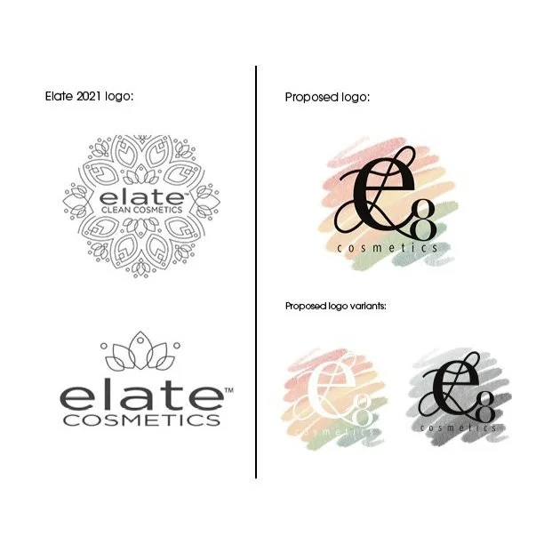
Elate Cosmetics branding in 2021 was in dire need of modernization. The lotus flower-inspired imagery was not working to attract young, environmentally conscious consumers in the way the brand intended.
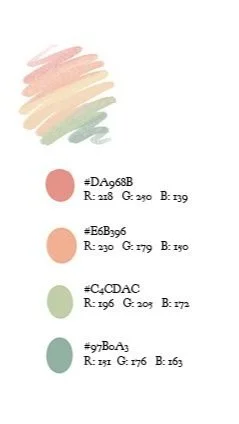
My main goal was to modernize the logo in a way that alludes to the brand’s relationship with sustainability. Rather than explicitly showing customers Elate’s ties to nature, I utilized a pastel, floral-inspired color pallet to provide a backdrop for the new logo. This logo is intended to prompt consumers to stop and stare for just a second. With cosmetics packaging in mind, I decided this logo will pop on the shelves next to its competition, rather than blending in as it did before.
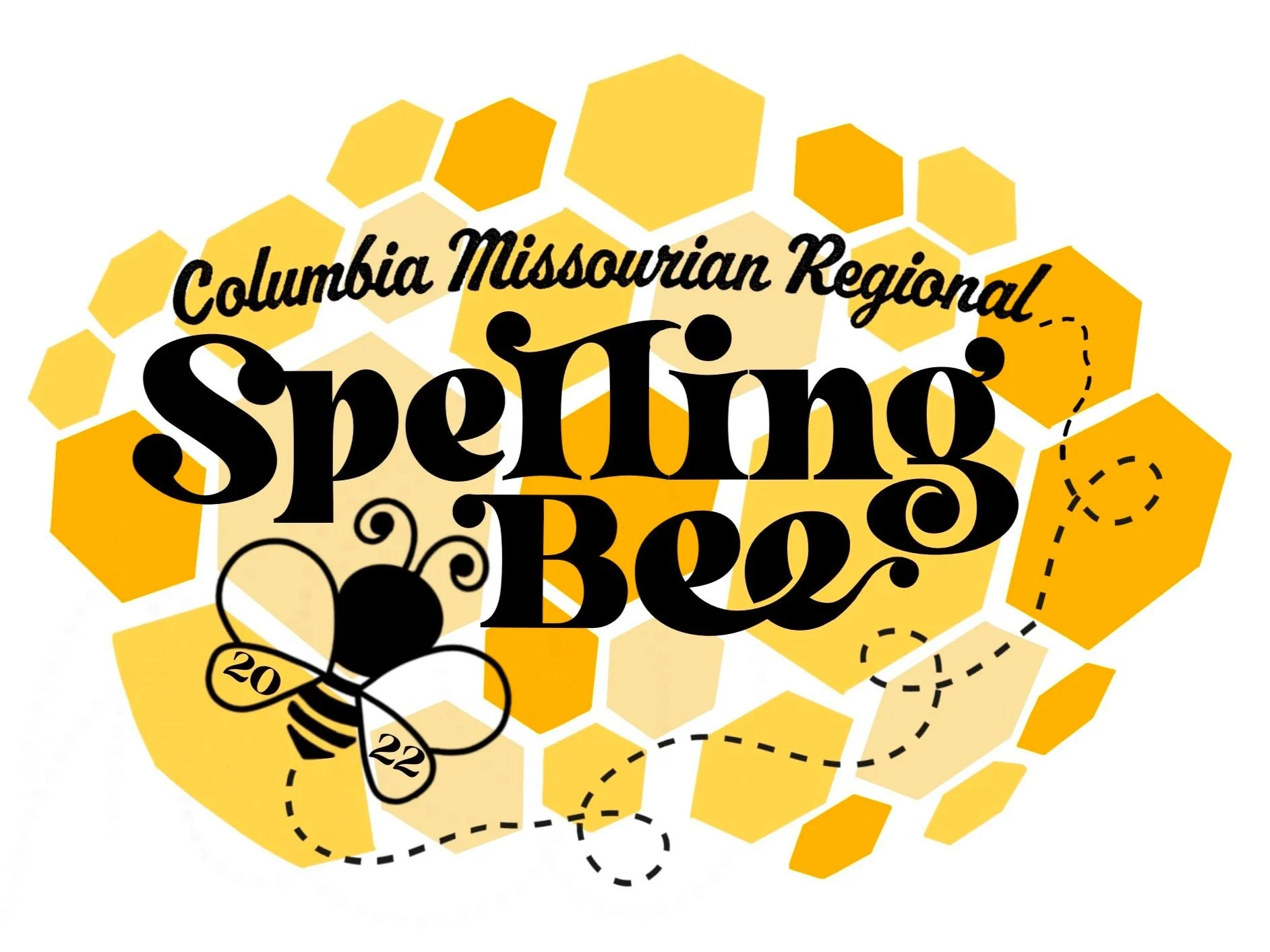

The Missourian, a newspaper affiliated with the University of Missouri’s School of Journalism, hosts the regional spelling bee in order to deepen consumer relationships and generate community buzz. With these intentions behind the event, I wanted to ensure the logo evoked positive memories of community and childhood.
I aimed to create a graphic that embodied the youthful nature of the event. For adults, the logo evokes memories of schoolyard days and the bus they rode home from school. For the spellers, the logo works to excite them about their recent achievement. This logo clearly stands apart from other spelling bee logos and cannot be confused with the Scripps National Bee logo.


Above is a remodeled logo for 1839 Taphouse, the establishment I bartended at throughout my college days. My senior year, the restaurant owner came to me wondering how he could rebrand the restaurant as “1839”, as opposed to “Tap” or “Taphouse,” the nicknames given to the bar by its regulars. Other requirements of the rebrand were to make the logo vertically oriented and simple enough to be engraved on a wood sign.
In order to make 1839, the year Mizzou was founded, the forefront of the brand image, we had to reassess the original logo’s visual hierarchy. To maintain consistency in the rebrand, the numbers in the new logo were inspired by the Old London typeface used in the original logo. Inspired by a variety of gothic typefaces, these numbers evoke the same grungy feel as the old logo, while meeting the requirements for the rebrand.
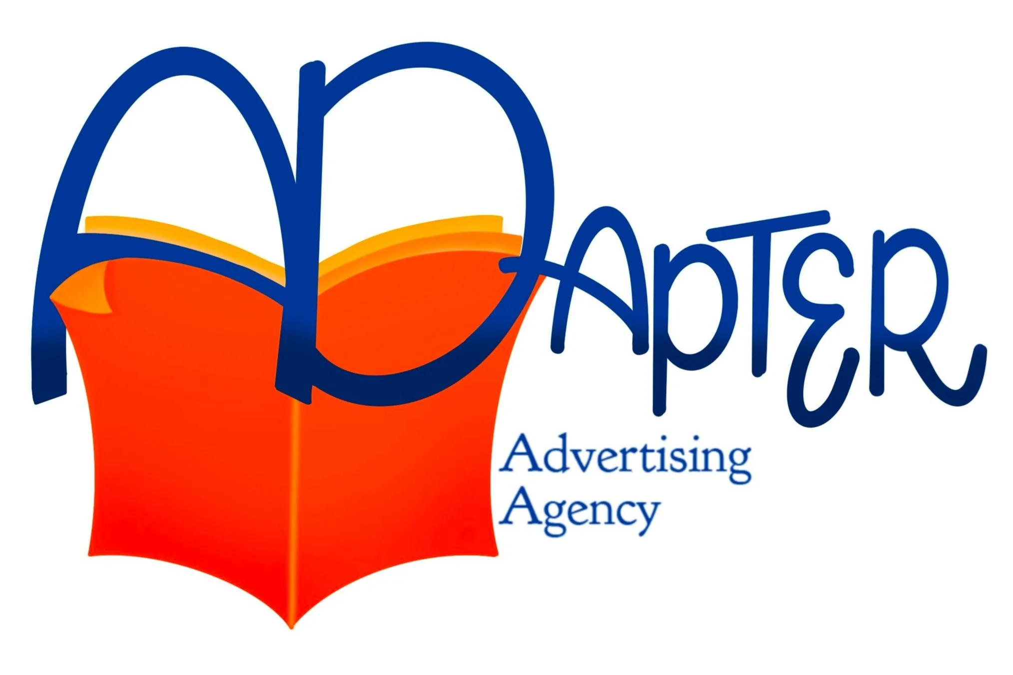
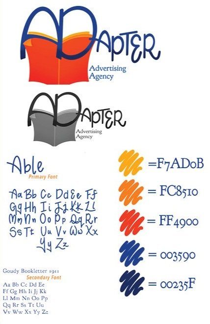
As a graphic designer for AdZou Student Advertising Agency, my first assignment was to brand our group with a logo. The agency name for my team was inspired by our group’s ability to “adapt” to a variety of clients and circumstances.
Visually, I wanted the logo to pay tribute to The School of Journalism and The Prison Journalism Project, our main client. The newspaper graphic does just that, as it is an ode to the team’s background in journalism as well as our devotion to traditional print media, as utilized by our client, The PJP. The pages of the newspaper in the logo lead into the line across the ‘A’. Once I had the newspaper and its interaction with the first two letters of the logo completed, I decided to draft a new typeface for our primary font. This swirly, bouncy font was used to contrast the rigidness of our client’s brand standards.